


Share this article
Table of Contents
Are you tired of watching your website traffic turn into nothing more than a bunch of tire kickers?
With killer call-to-actions, it's time to turn those passive site visitors into paying customers.
Let's take a look at our favorite call to action examples and how to A/B test them for improvements.What Is A Call-To-Action (CTA)?
Whether it's presented as a button, link, or banner, a CTA is an instruction or suggestion designed to encourage users to take specific actions that align with your business or organization's goals.
The best call-to-actions ultimately drive conversions.
For this reason, CTAs are purposefully designed to be persuasive, eye-catching, and prominently placed to grab a potential customer's attention. The best-performing CTAs provide concise, informative language that is easy to understand and precisely conveys the desired action.
Later, we'll break down best-in-class call-to-action examples to see exactly what effective calls-to-action look like in practice. For now, though, let's jump into what factors make a good CTA.
Why should you create a strong call to action?
Research has repeatedly shown that optimized CTAs are valuable for driving conversions and moving potential customers along the buying process.
Here are a few key takeaways from the currently available research:
- This case study found emails containing a single CTA increased clicks by 371 percent and sales by 1617 percent.
- Another case study found across all industries, CTA buttons received the highest average click-through rate (CTR) with 5.31 percent, designed-based CTAs averaged a 3.53 percent CTR, and text-based CTAs averaged 2.06 percent CTR.
- This study concluded that CTA placement significantly affects conversion rates (CVR). Sidebar CTAs saw 0.5-1.5 percent CVR, generic end of post-CTAs 0.5-1.5 percent CVR, pop-ups 1-8 percent CVR, sliders/bars 1-5 percent CVR, welcome gates 10-25 percent CVR, and feature box 3-9 percent CVR.
The Most Common Types Of CTAs
Now that we've covered what makes a compelling CTA let's break down the different types of CTAs:
Call-To-Action Examples
Now we've tackled the elements that make a CTA effective, let's use the below call-to-action examples to see what this looks like in practice.
Effective CTA button examples
As we’ve discovered, the most effective CTAs, CTA buttons included, use action-oriented language and communicate the value of the action you want the reader to take.
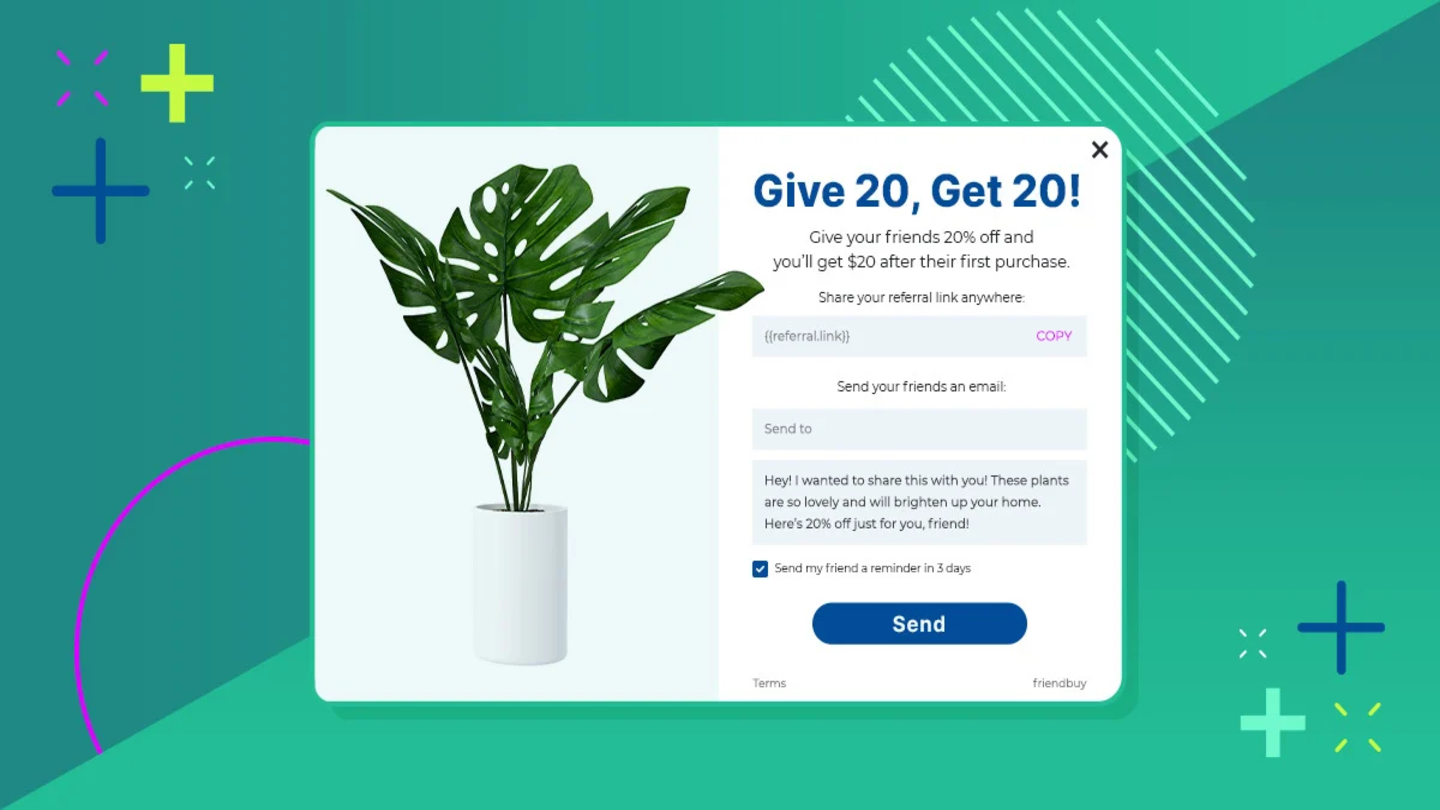
Outdoor Voices makes another appearance in this post with their referral landing page.
.jpg?width=940&height=441&name=OV%20landing%20page%20cta%20(1).jpg) Outdoor Voices’ referral landing page is an excellent example of this approach.
Outdoor Voices’ referral landing page is an excellent example of this approach.
Their CTA button’s positioning and word choice, coupled with the CTA description and heading, communicate to website visitors that completing the sign-up process and sharing the Outdoor Voices referral link will earn them $20 store credit and grant their Friends the same benefit.
CTA Button/Phrase: “Start Sharing”
What we like about it: Focusing on the community feeling is a smart move. They really highlight the point with their CTA "Start Sharing".
How to replicate this:
- Create a clear and concise headline that makes sense of and communicates the value of the action.
- Highlight incentives for the Advocate (referrer) and the Friend (referred).
- Design a referral program page consistent with the brand's overall style.
Things to A/B test:
- The button color. Test different colors to see which leads to the most conversions.
- Language. Create different word choice variations, test, and determine which performs best.
- The button size. Test larger buttons against smaller ones to see which one receives more clicks.
- The button placement. Test different placements on your website or landing page to see which leads to the most conversions.
Website call to action examples
When it comes to web design, it's hard to ignore the importance of website CTAs, or calls-to-action. They're those little buttons that appear in various locations on a website and encourage users to take specific actions.
Whether it's clicking on a link, purchasing a product, or signing up for a newsletter, CTAs are responsible for driving conversions and generating more customers.
Nicokick cleverly uses this opportunity to encourage referral program sign ups with a massive 50 percent discount. On the bottom left-hand corner of their website, no matter what page you’re on, has an offer up to 50 percent off.
.jpg?width=800&height=311&name=neokick%20website%20referral%20widget%20(1).jpg)
When clicked, the button opens up their referral widget, which breaks down their tiered rewards program.
.jpg?width=400&height=398&name=nicokick%20pop%20up%20widget%20(1).jpg)
Their refer-a-friend widget uses several best practices, from simple, action-oriented phrasing to a CTA button color that converts. The CTA heading and description are concise and unambiguous. While the page’s CTA button, located front and center, gives users a compelling reason to take action while reinforcing the value of doing so.
CTA Button/Phrase: “Up To 50%”
What we like about it: Its bold, bright, widget colors and that the details of the tiered rewards program are front and center.
How to replicate this:
- Create an eye-catching design that stands out from the other elements on the page.
- Use your best referral offer, like up to 50% discount, to entice clicks on the sitewide button.
Things to A/B test:
- Referral offer. The referral offer is the easiest thing to test, so you can find the exact formula that gets you the most signups. Test both different referral offers and which ones you put on the button.
- Headline. The headline is often the first element a website visitor notices when the widget pops up, so it's essential to make it clear, compelling, and action-oriented.
- Font. Testing and determining a font that is easy to read, visually appealing, and appropriate for the CTA's desired tone and message can help increase its effectiveness.
- The button shape. It may seem trivial, but testing round buttons against square ones to see which gets the most clicks will increase conversions.
Call-to-action examples that use high-converting phrases
To maximize conversion rates, it's important to use compelling CTA phrases. MeUndies cuts to the chase with a strong value proposition in three simple words: "Get Free Undies."
.jpg?width=1896&height=507&name=meundies%20footer%20cta%20on%20account%20page%20(1).jpg)
Just below the pitch are the details of the sweet offer in one sentence. Then the referral link is right there, ready to be copied.
It's a quick and dirty CTA that brings in a decent amount of new customers every month.
CTA Button/Phrase: "Get Free Undies"
What we like about it: This CTA gets to the details fast.
How to replicate this:
- Provide a tangible reward that encourages visitors to take action.
- Highlighting the value of the promotion for customers will increase conversions.
- Keep the language clear and concise while communicating the value of the action you wish customers to take.
Things to A/B test:
- Persuasive language. Social proof, scarcity, and urgency will motivate the audience to take action, so test different verbiage variations to determine which performs best.
- Placement. Altering the placement of a CTA, such as above the fold or in a menu bar, will help to determine which location increases its effectiveness.
- The button text. Test whether strong action words motivate your target audience against persuasive language.
- Imagery. Determining relevant visuals that appeal to your audience is a powerful tool for boosting engagement and conversions.
- Target audience. Showing different CTAs to new users versus returning users will effectively tailor the message and increase conversions.
Call-to-action examples on social media
Incorporating compelling call-to-action phrases in your social media marketing efforts is a powerful way to make use of your social media audience.
The Spice House takes advantage of their Instagram views by periodically sharing a CTA for their referral program, product launches, and other marketing campaigns.
.png?width=400&height=866&name=instagram%20cta%20(1).png)
The specific language used in the CTA, "Get 15% for every friend you refer," highlights the value that the user will receive if they swipe up.
The words "friend" and "you" personalize the message and make it more relatable, which can be a powerful way to increase conversions.
It's not a flashy CTA but it's clear and simple, making it perfect for popping into social media periodically.
CTA Button/Phrase: "Get 15% for every friend you refer"
What we like about it: It's clear what the offer is and what's expected of the viewer. The image makes it easy for the viewer to imagine him or herself benefitting from more spices for 15% off.
How to replicate this:
- Offer a compelling reward to motivate action and increase conversions.
- Incorporate personalization elements to make the message more relatable.
- Stick to on-branding messaging and imagery—particularly important to IG, where visual communication is key to ensuring your CTA resonates with your target audience.
Things to A/B test:
- Verbiage. By carefully selecting the right words and phrases, businesses can craft a CTA that effectively guides users toward the desired outcome.
- Visuals. By carefully selecting relevant and visually appealing visuals, businesses can increase users' chances to notice and interact with the CTA.
- Colors. Different colors evoke different emotions and associations, so it's essential to choose colors that align with the desired message and tone of the CTA.
- Font. Choosing a font that is easy to read and visually appealing can help increase the CTA's effectiveness.
Call to action examples in digital marketing
Digital marketing is basically anything that connects your content to a user and CTAs are the sturdy bridge that connects the two and drives conversions. Take SPANX for example.
.png?width=600&height=366&name=spanx%20website%20cta%20(1).png)
The Spanx referral program website ribbon and promotion in its website header menu are excellent examples of standard, yet extremely effective, calls-to-action in digital marketing.
Both elements are highly visible and immediately capture the user's attention. Using an on-brand colored ribbon design and bold, action-oriented language, such as "Get $10," effectively communicates the value and benefits of the referral program and motivates users to take action.
Complementing the website ribbon, a menu CTA is prominently in the header, a key location for capturing the user's attention and driving referrals.
CTA Button/Phrase: "Get $10 off: Find Out How"
What we like about it: SPANX's consistent design and message throughout the website reinforces its brand identity and helps to create a cohesive user experience.
How to replicate this:
- Utilizing a prominent and visually appealing design, such as a ribbon, businesses can effectively draw attention to their referral program and motivate users to take action.
- Incorporating clear, action-oriented language in your marketing efforts guides users toward the desired action and increases conversions.
- Maintaining consistency in the design and messaging across all marketing channels reinforces brand identity and creates a cohesive user experience.
Things to A/B test:
- Design. The ribbon and menu CTAs could be A/B tested to determine which elements, such as color, size, and layout, are most effective at capturing the user's attention and driving conversions.
- Language. The action-oriented language used in the CTAs could be A/B tested to determine which phrases and words are most effective at motivating users to take action.
- Placement. The placement of the ribbon and menu CTAs on the website could be tested to determine which location is most effective at capturing the user's attention and driving conversions.
- Personalization. The use of personalization in the CTAs, such as the word "friend," can be tested to determine its impact on conversions.
The Bottom Line
No matter what all of the “rules” say, you’ll still need to test and find what works for your audience. We love A/B testing so much that we built it right into our software! Give it a try and share with us what worked for you. Interested in boosting your brand’s revenue? Book a call with our team to learn more about referral and loyalty marketing.

